 Before.
 The picture is a little dark and does not do justice to just how ugly it was. This was an example of a good idea gone horribly wrong. From the picture I had in my mind - to what the paint contractor heard - to this. And whatever they used to seal the top yellowed, so it really was pretty bad.
 So I stripped it,
At this point I wasn't sure what I was going to do with it. I contemplated trying to achieve what I had in mind the first time around but as I worked with this piece and pondered what to do, I began to realize how simple the design is. It seemed to speak to me and what I heard was, "kiss it", also know as keep it simple sweetheart.
I used polyurethane satin finish and bee's wax to seal it.
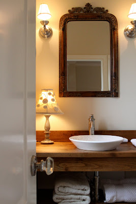
It looks so good - much, much better.
 Next, I need to find something to go on the wall above the commode and a white rug for the floor. Two very easy things to do.
 I don't really need storage but maybe a cute shelf for display or a nice picture.


 So, what do yo think? Kind of a quiet, almost spa look.


 So, what do yo think? Kind of a quiet, almost spa look.
 I'm linking up again, woo I'm on a roll twice in one day. Now if I can just figure out how to link to more than one party.
Linking up with Susan's party, Met. Monday at Between Naps on the Porch.
And DIY Showoff


18 comments:
Very very nice. I admire your determination. I would have been overwhelmed at the thought of taking it back to "before" and starting over. Very original. So's the lamp.
I love the change in your guest bath! It does remind me of a spa, your guest may not want to leave!
Excellent job!
Dee Dee
Oh I LOVE it!!! What a difference that made!!
Suzanne
Amazing redo. i love the wood stain and just makes all the whites pop. I linked to the same party.
Mmmmmm, it is soooo pretty. Gerry
I love it! Is that a meat tenderizer? lol.... It's beautiful. Well done.
Love to you
Kelly
I've Become My Mother
Jerriann,
You did a great job on the vanity! I really like the distressing as well as the stain color! Love the open, fresh feel of the room! I'm impressed you moved it out of the room to do all the work! That would have been a deterrent for me. Good job!
Hi Jerri,
Yes, it is spa like! I really love how you distressed the vanity. I thought for sure this was a vintage piece that you had retro fitted into a vanity, it's that convincing! Adore your sink, too! Thanks so much for stopping by, and for your nice comments. I am not sure if there is a way to link up to more than one party at a time or not. I post buttons on my side bar of parties that I like to participate in, so I won't forget them! I try & link up to a few each week. They are addicting!
Great job!!! Love the new color.
Love the simple design of the vanity and white bowl. So glad you had the courage to start over and not just live with it. Good job
Very calming and simple. Love the effect of the lamp. Looks like a b&b.
hopped over from remodelaholic... I love the new look, even though I also liked the old look.
I'm curious about what color stain you used?
myrepurposedlife@gmail.com
great job! I wish I had a bathroom like this, let alone a "guest" bathroom! hahah
gail
that is GORGEOUS! i love the rustic wood combined with the mdoern sink and the glam mirror- it all works so well together!
Looks beautiful, love the new stain color and the distressing. I love that sink too!
The entire vanity & sink is gorgeous! I think I have seen what I want in my guest bathroom!
Absolutely gorgeous and I LOVE the mirror. Congrats on a beautiful "makeover."
Oh I love your vanity!!! I REALLY like the stain you used...oh please can you please tell me the color of stain you used?
from the ever so far away Texas,
Amanda
Okay, third stop. I'm hooked. you have a new follower. :)
Pam
Post a Comment